Quick Guide To Learning CSS Flex
Another CSS Flex tutorial with my new diagrams for visual speed-learners.
Check out my coding books CSS , JavaScript and Python. Some of them are also available on Amazon if you need an extra reference at your desk.
Let's learn CSS Flexbox visually
Hello folks, this CSS flex tutorial I think is one of the fastest ways to learn how flex works. I created several diagrams to help you on your journey!
So what is flex exactly?
CSS Flex is a ruleset of properties for helping create responsive layouts. Officially Flex was actually called Flexbox which stands for flexible box but most people simply call it flex.
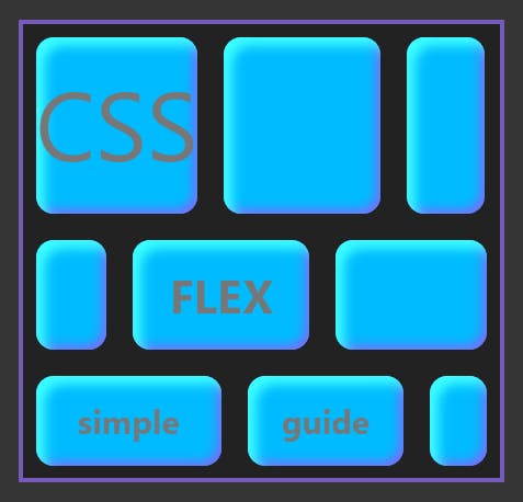
While flex isn't inherently a grid-based layout you can make grids with it or content galleries that span across multiple rows.
Flex self-regulates actual amount of space between items inside parent container. That's because layouts created with CSS flex adapt to the dimension of your parent element. The resizing that takes places will be based on the size of the screen, dimensions of neighboring items and the space between them.
Check out my css book visual dictionary. Here's css book review on Semicolon. Check out also this css book page if you want to reserve a copy!
Centering Everything
For years past-generation web developers used float:left and float: right properties to align content to either side horizontally. But there wasn't a standard way of centering content vertically. Flex solves this problem. One of the most common use cases for flex is centering elements in both dimensions:
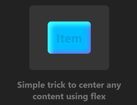
By setting display: flex, justify-content: center and align-items: center to your parent you essentially tell flex to "center everything."
This will center inner text (which isn't exactly the same as child elements, it's just a text node) as well as any div elements. This setup will also center multiple rows of items.
Why are some layouts good and others aren't? (TLDR: It's margin space)
Have you ever thought about what makes a good website layout? Why do some layouts look appealing to the eye, without having to analyze its structure?
Why when reading a book you generally don't care to notice that it actually has margin. But you would notice their absence if there weren't any? The key to good design is function and utility. This utility is closely tied to how our eyes interpret spatial space.
This means that at the core of good layout design is margin space. Flex was designed to give you control over margin space between items.
So what about margin space? Designers of flex already thought about all possible distinct cases that actually make sense (To be used with properties like justify-content and align-content).
This makes flex an ideal tool for creating responsive website layouts.
Parent container and item content
Flex block consists of parent container and nested items. Some flex properties should be applied only to parent. While others only to items.
Main-axis and Cross-axis
Thinking in flex involves knowing about main-axis and cross-axis. Main-axis - the horizontal one - is the default. Placing items inside flex container will automatically align them against main-axis.
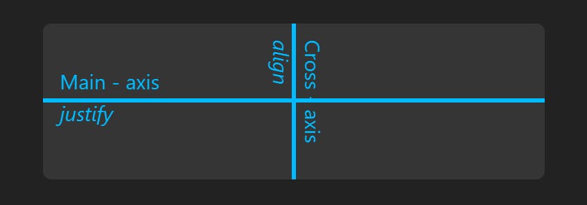
CSS Flex properties justify-content and align-content
Get used to these two properties and make them your second nature!
Along Main-axis you'll use justify-content property for creating spacing between items. On Cross-axis you will use align-content property to do the same vertically.
However align-content only works if there are multiple rows of flex items. (That is, you have more items that can fit into the width of your container and "wrap" onto the next line. You'll need to apply flex-wrap: wrap in order for your items to jump to next row.)
##How To Enable Flex On An HTML Element?
Flex can be applied to basic HTML elements that deal with dividing or sectioning your layout into separate blocks.
To make an HTML element behave as a flex container simply apply display:flex property to parent:
HTML code:
<div id = "flex"></div>
CSS code:
div#flex { display:flex }
With a single item flex will look like this by default:
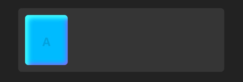
Provided that you also set some type of basic dimensions to the item as shown in the following example (note CSS variable was used to set background color. Just set it to whatever you want.):
.item {
    font-size: 28px;
    font-weight: bold;
    border-radius: 8px;
    min-width: 100px;
    line-height: 125px;
    text-align: center;
    background-color: var(--flex-item-bg);
}
Populating flex container with items
Now all you have to do is simply nest your flex parent container with as many items as you need.
<div id = "flex">
   <div>A</div>
   <div>B</div>
   <div>C</div>
</div>
You will need to apply some basic styles to each item depending on what you're trying to make. That's entirely up to you! In this example box-shadow property was used to make the item stand out.

By default flex will justify content left (value flex-start). This means the value flex-start is applied to justify-content by default.
**Now onto the fun part. Aligning items!
Flex has a set of unique values you can assign to justify-content property. And for the most part, this is what designing layouts with flex is all about. It's choosing amount of space you want to have between your items.
Let's try this simple example first.
I edited div#flex style in the following way:
div#flex {
    display: flex;
    justify-content: space-evenly;
}
Simply adding justify-content: space-evenly; modified our items as follows:
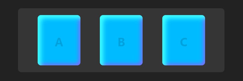
Now there is a multitude of different values you can apply here.
They all produce similar but slightly different spacings.
In the next section of this tutorial I'll go over them with a flex diagram that can help you to quickly understand how they all work.
Using justify-content
This flex diagram makes it easy to understand how values set to justify-content work. To the left you see each value name and to the right the effect it has on spacing between your flex items:
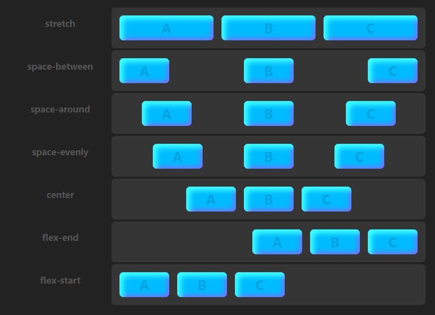
Description of all justify-content values:
- stretch Stretch all items to fill 100% of the parent's width
- space-between Equal space between all items. No space on outside corners.
- space-around Equal space around all items. Half space on the outside corners.
- space-evenly Equal space around all items and parent edges.
- center Center all items. No space between items.
- flex-end Align all items right.
- flex-start Align all items left. (Default.)
Keep in mind flex-direction: row is the default setting. This is why all items are justified on the horizontal (main) axis. However, it's possible to swap axis by setting flex-direction to column.
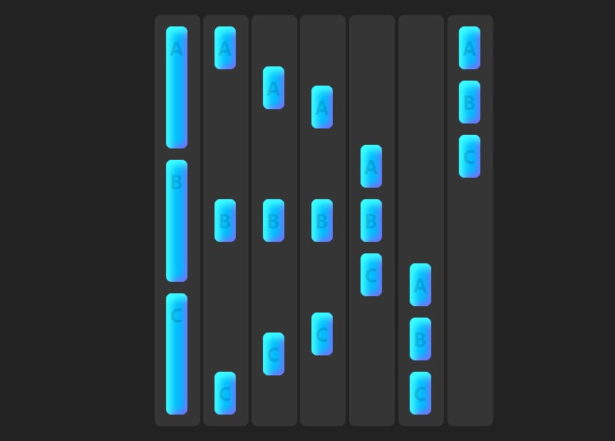
Doing this will not affect justify-content in any different way -- it simply gets swapped with cross-axis and becomes the vertical axis -- items will be now spaced vertically. (See next example.)
Using justify-content with flex-direction: column
This is the same example as above. All we did was set flex-direction property to column.
Using align-content to create vertical spacing
There may be some confusion at why align-content isn't working for your layout. Many try applying this property to parent in hopes of using it as an opposite to justify-content.
But there is one gotcha! This property requires more than one row. Otherwise there is no effect.
To make sure your items wrap to the next line, set flex-wrap property to wrap value in your main container first.
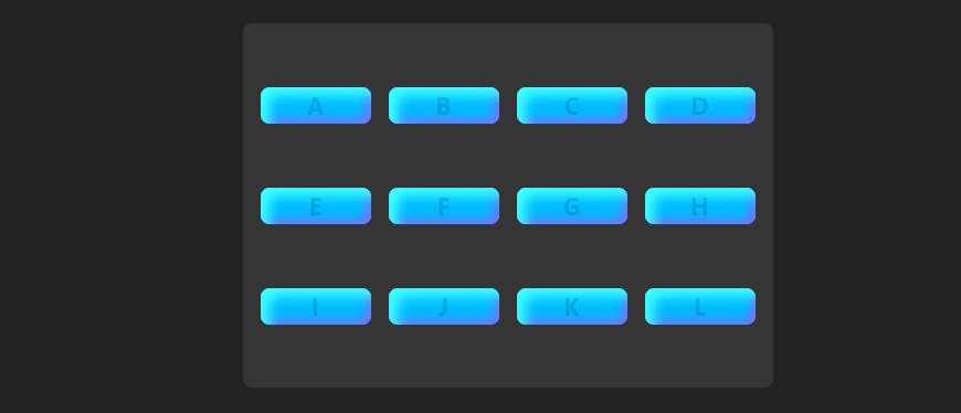
Here 12 items were strategically used to fill up an equal number of lanes.
Let's apply stretch value to align-content property:
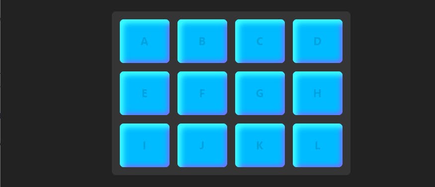
This creates a grid-like layout.
Other Flex References
CSS Flex Tutorial the complete css flex tutorial
Less Common CSS FLex Patterns In 10 Minutes how to make grid and column-based layouts with flex
Learning flex is an ongoing process, and there is no "one fits all" solution for creating responsive layouts with css flex. Learn from multiple resources.
Why did I write this CSS flex article on Hashnode?
I like writing a different version of the same article because I noticed it helps me solidify what I already know about a subject. Writing about it several times cements it. Following this model I have created several flex tutorials now.
Every time you start a new tutorial you start from knowledge you have at that time. This is why no matter how many times you write a tutorial on the same subject it always comes out different. Somehow better each time.
I first deployed this strategy a few years ago. I noticed that even after writing about CSS Flex several times, you become familiar enough with it to "go to the next level" -- now that you understand basic flex properties, you can build understanding of more advanced subjects based on that foundation.
For me personally, it's more about writing a better tutorial next time. I also noticed people are more likely to love "complete" tutorials more. Knowing a subject in greater depth also makes it possible to make more creative tutorials.
I wouldn't have ever created my animated css flex examples if I didn't gradually develop more solid knowledge which helped me write some of my top ranking tutorials on Google. And now even more people are linking back than ever.
If I don't do this, every time I need to recall some css flex feature, I have to Google it again. I think with improved accessibility of information over the last years we developed a habit of not needing to memorize anything. For makers of things that isn't always ideal place to be.
#Octopack is my coding book bundle.
Hey readers! At the end of each tutorial I advertise my coding book bundle. I don't know if it's going to work as I don't really do marketing well. But I decided to follow this protocol just to see what happens.
The pack includes CSS Dictionary, JavaScript Grammar, Python Grammar and few others. Just see if you might need any of the books based on where you are on your coding journey! Most of my books are for beginners-intermediate XP.
I don't know who is reading my tutorials but I put together this coding book bundle that contains some of the best books I've written over the years. Check it out 🙂 I reduced price to some regions like India, Nigeria, Cairo and few others. Prices are just so different here in the U.S. and all over the world.
You can get Octopack by following my My Coding Books link.

