It's impossible to learn CSS grid in 5 minutes. But it's enough to go through this tutorial just to see what type of features are available. Ok, maybe it will take 10 minutes. CSS grid specification is huge and has some dinosauric (long) property names and it's why often people simply go back to using flex.
Also here's the complete css grid tutorial at Semicolon.
Diagrams are from CSS Visual Dictionary (a book that covers all CSS properties visually. Great desk reference for those just getting started with CSS.)
My first goal was to outline all grid features. I started to expand I realized there is much more to CSS grid specs that can fit into a 5 minute tutorial.
Let's start with fractional units (fr-units)
There are 14 types of CSS units (cm, mm, q, in, pt, pc, em, rem, ex, ch, vw, vh, vmin, vmax,) percent % and fr-units (so a total of 16, you can say.)
When learning CSS grid you might want to start out with fr-units. They are similar to percent but more flexible. See examples below to get an idea of how they work.
Fractional units (or fr-units) help you equally divide remaining space (compared to items whose dimensions are already defined.) But if you use only fr-units for all grid items, it's helpful for creating columns that scale relative to each other.
Example: 1 item set to 1fr occupies 100% of entire container. 2 items set to 1fr would occupy 50% each. 3 items set to 1fr would be 33.33% each (100/3) etc.
Common CSS Grid Properties
One major principle behind CSS and coding in general is code reuse. Instead of retyping properties for each element let's define grid properties with a set of classes. This will save time and makes it easier to learn grid.
/* basic grid definitions */
.g { display: grid }

/* generic style for all grid items */
.g div,
.g section,
.g article { }
The grid-template-columns and grid-template-rows are the two properties for defining dimensions of each column and row space on both axis.
Most websites or web apps use 2, 3, 4 column layouts. Maybe 5-6 max, unless it's a large image gallery. So I would treat the following classes as a starting point.
/* number of columns */
.c1 { grid-template-columns: 1fr }
.c2 { grid-template-columns: 1fr 1fr }
.c3 { grid-template-columns: 1fr 1fr 1fr }
.c4 { grid-template-columns: 1fr 1fr 1fr 1fr }
.c5 { grid-template-columns: 1fr 1fr 1fr 1fr 1fr }

/* number of rows */
.r1 { grid-template-rows: 1fr }
.r2 { grid-template-rows: 1fr 1fr }
.r3 { grid-template-rows: 1fr 1fr 1fr }
.r4 { grid-template-rows: 1fr 1fr 1fr 1fr }
.r5 { grid-template-rows: 1fr 1fr 1fr 1fr 1fr }
Normally you wouldn't code this way. This is just for the purpose of this tutorial. But it's a good first step toward getting to know how rows and columns work.
The grid-template property is a short hand for all of the above. It accepts multiple types of values. It can be used to define grid template areas (example later in this tutorial.) Or it can be used to shorten grid-template-rows and grid-template-columns:
/* Short-hand for grid-template-rows and grid-template-columns */
grid-template: 100px 1fr / 50px 1fr;
grid-template: auto 1fr / auto 1fr auto;
You can plug in your own dimensions instead of fr-units. This is just a tutorial so we're breaking down to most common cases (but px and % will work too.)
To create a 3 by 3 grid you could construct it using following HTML code:
<!-- html -->
<main class = "g r3 c3">
    <section>1</section>
    <section>2</section>
    <section>3</section>
    <section>4</section>
    <section>5</section>
    <section>6</section>
    <section>7</section>
    <section>8</section>
    <section>9</section>
</main>
This will arrange all section elements into a tic-tac-toe grid with 9 items.
Cells and items
It's important to know that grid template columns and rows simply define cell space. They don't physically create items. They are just the definitions of how much space an item should occupy in a given cell/column/row if it is placed there. The grid remains an empty skeleton - a layout dimensions blueprint - until you insert some <section> (or <div>) items into the parent grid element.
Lines (or grid lines)
CSS grid lines are the numbered lines (that start with 1, not 0) in both dimensions.
There is also a negative coordinate system. It's like lines, but counted from the end (the other side) of the grid (lower right corner) and starts with -1, then -2, -3:
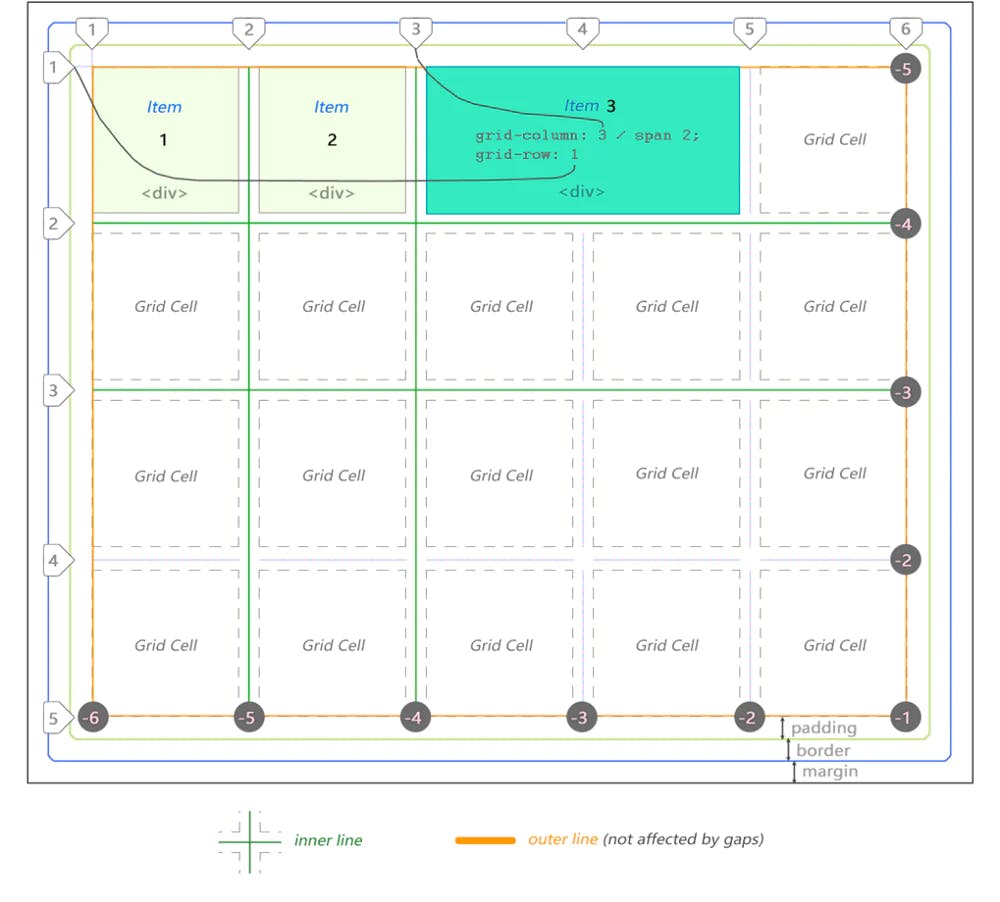
To recreate this layout with our current setup defined by CSS grid classes above, you'd do something like this in your CSS source code (this is just an example:)
<!-- html -->
<main class = "g r4 c5">
  <!-- insert 20 items <section> or <div> etc -->
</main>
Gaps (or grid gaps)
You can define vertical and horizontal gaps. This isn't the same as padding or margin. This property is unique to CSS grid.
Properties grid-column-gap and grid-row-gap are used to do that:
/* gaps */
grid-row-gap: 10px
grid-column-gap: 20px
Or just the shorthand gap <row-gap> <column-gap>:
/* Short-hand for making gaps */
gap: 10px 20px
The property grid-gap may need to be used in some browsers.
Note: gaps cannot vary in size across multiple lines in the same dimension. If you set horizontal gaps to 10px they will be 10px for each line. The only way to create "your own gaps of any size you want" would be to create more space between by adding an invisible column and change its width.
(The set for common flex properties can be found in my other CSS flex tutorial.)
You can span an item across multiple cells.
Important: Spanning changes location of the surrounding items.
Spanning using grid-column and grid-row
Using grid-column and grid-row properties on the item element itself:
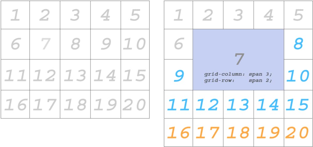
The blue items changed location after making Item 7 span across multiple cells. And orange items were bumped down a row.
There is also another way of doing the same thing…
Spanning using grid-column-start
And also... grid-column-end, grid-row-start and grid-row-end are used to specify starting and ending points across which you want to span cell content.
I removed the items past 15 (orange ones) because we no longer need them:
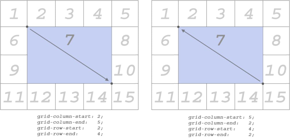
(Type these properties directly into the item you wish to be affected by them.)
Stretching content across column and row lines works in both directions.
min-content and max-content
The values min-content and max-content are supplied to grid-template-columns or grid-template-rows properties just like any other size-related value (for example px, 1fr, etc.)

Let’s take a look at this specimen. It is our starting point. We’ll change things around a bit to see how min/max values affect cells.
Let’s see what type of results will be produced if we switch one of the columns to min-content and max-content:

With one-word text there’s no difference between the results observed whether we use min-content or max-content. Here it is because hello is a single word. Its min and max values are exactly the same.
Template Areas
Template areas make it possible to define content area that spans across more than one item cell. Here's a visual:
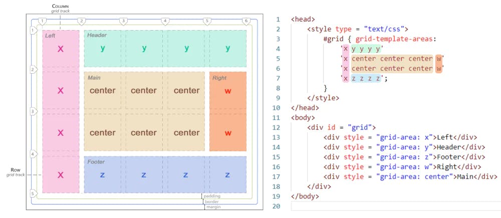
And to create this here's what your grid source code might look like:
<!-- html -->
<head>
  <style type = "text/css">
    #g {
      display: grid;
      grid-template-areas:
      'x y y y y'
      'x center center center w'
      'x center center center w'
      'x z z z z';
    }
  </style>
</head>
<body>
  <div id = "grid">
    <div style = "grid-area: x">Left</div>
    <div style = "grid-area: y">Header</div>
    <div style = "grid-area: x">Footer</div>
    <div style = "grid-area: w">Right</div>
    <div style = "grid-area: center">Main</div>
  </div>
</body>
grid-template
The grid-template property is the shorthand for template areas and template rows and columns. Here's an example of using it to define various grid values:
/* to define just the template areas */
grid-template:
"x a a"
"x b b";

/* define template areas, grid-template-rows and grid-template-columns */
grid-template:
"x a a" 1fr
"x b b" 2fr;

/* using percent and auto */
grid-template:
"x a a" 20%
"x b b" auto;
What about grid-auto-rows and grid-auto-columns?
What happens if you add more items than what's defined by grid-template-columns and grid-template-rows? These cells will be defined by "automatic" or "implicit" space.
Use grid-auto-rows and grid-auto-columns to define what that automatic spacing (that goes beyond template definitions) should be for any extra items added.
grid
The grid property is also a shorthand for pretty much everything:
grid-template-rowsgrid-template-columnsgrid-template-areasgrid-auto-rowsgrid-auto-columnsgrid-auto-flow
Naming Grid Lines
You can name grid lines if you'd like.
This illustration demonstrates how that works:
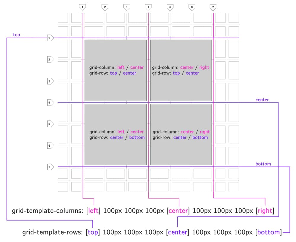
You can also name lines/gaps with grid-template-column or grid-template-rows property or any of the short-hands that support those properties (grid, grid-template.)
Use square brackets to name your lines. Then use these names when specifying the length your items need to span across using / slash.
Grid is a two-dimensional layout system
Unlike CSS flex (which by default renders as one continuous line of content in one dimension) CSS grid is based on two axis. It's a two-dimensional system that makes you think of your layouts in terms of rows and columns.
Using grid and flex together
It's common for web designers to use CSS grid for defining the large skeletal structure of the entire website or app. Flex containers can be used for grid items.
Complexity
Some web devs think CSS grid is way too complex and choose flex to build their layouts. The number of properties and their length (when used without short hand format) can be overwhelming.
#Octopack is my coding book bundle.
Hey readers! At the end of each tutorial I advertise my coding book bundle. I don't know if it's going to work as I don't really do marketing well. But I decided to follow this protocol just to see what happens.
The pack includes CSS Dictionary, JavaScript Grammar, Python Grammar and few others. Just see if you might need any of the books based on where you are on your coding journey! Most of my books are for beginners-intermediate XP.
I don't know who is reading my tutorials but I put together this coding book bundle that contains some of the best books I've written over the years. Check it out 🙂 I reduced price to some regions like India, Nigeria, Cairo and few others. Prices are just so different here in the U.S. and all over the world.
You can get Octopack by following my My Coding Books link.


