


Check out my book JavaScript Grammar to learn JavaScript visually!
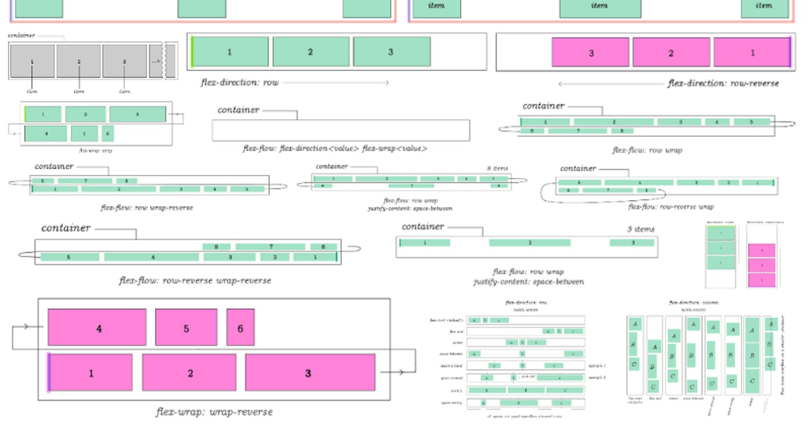
If you want a more detailed outline check out the complete css flex tutorial at Semicolon.
Flex has crystallized itself as the modern day standard for designing responsive layouts. You probably think flex is something that will be difficult to learn.
But over the years writing CSS flex code you'll notice the repetitive redundancy of your code. For example in order to enable flex on an element:
display: flex;
justify-content: center;
align-items: center;
Packaging your flex properties into 1-letter classes
Let's create a simple CSS framework of our own with 10 lines of CSS.
.f { display: flex; }
.r { flex-direction: row }
.c { flex-direction: column }

/* vertical stuff */
.v { align-items: center }
.vs { align-items: flex-start }
.ve { align-items: flex-end }

/* horizontal stuff */
.h { justify-content: center }
.hs { justify-content: flex-start }
.he { justify-content: flex-end }

/* wraps - we're going to need it! */
.w { flex-wrap: wrap; }
.wr { flex-wrap: wrap-reverse; }

/* because this is arguably the prettiest spacing*/
.s { justify-content: space-around }
Of course there are many more flex properties...but common ones can be counted on fingers of both of your hands. Literally there are like the same 10 properties you'll find yourself using a lot.
Add more if something's missing. The idea is to just use these simple class names on all of your HTML elements to build with flex. (Instead of typing and retyping long flex property names in 100s of your classes.)
Let's make a layout with centered item:
To use this home-brew css "framework" let's create a centered flex item:
<main class = "f v h">
  <section class = "f v h">
    I am centered
  </section>
</main>
For designs that need to flow in row direction:
<main class = "f r"></main>
For column direction:
<main class = "f c"></main>
Now let's make a flex with row direction that wraps columns:
<main class = "f r w"></main>
Add or replace any of the CSS classes we created to get the align you're looking for. Doing it this way will dramatically reduce time it takes to make css flex layouts.
Wrapping items (to make Flex content grid-like)
At one point you'll want to wrap flex lines at an interval after a number of items.
Flex content is just one long line that can be broken, it doesn't have natural properties for controlling rows or columns as you would in a grid.
This is done in order to make flex layouts grid-like (column-based.)
There are two common ways of doing that.
Wrapping with flex-wrap: wrap (or flex-wrap: wrap-reverse)
Set your flex container to flex-wrap: wrap:
<body>
  <section class = "f w">
    <section>1</section>
    <section>2</section>
    <section>3</section>
    <section>4</section>
  <section>
</body>
Then set width of the container and #columns section { } to values you need.
For example to make a 2 column design, set container to 1000px and each item to about 500px (half of the container or slightly less to avoid extra padding or borders.) Each flex item will wrap forming a two-column layout.
Using a flex item as a breaker to create column-based layouts
Remember css flex is just one line of content so we can't access grid-like properties to create multi-column layouts with flex.
Another way of creating multi-column layouts is to use CSS to assign "every Nth" child item to act as a line break.
Creating 2-column CSS flex layout
If you need a 2-column layout you can use following code:
<body>
 <div id = "container" class = "f r w">
  <div>1</div>
  <div>2</div>
  <div>break</div>
  <div>3</div>
  <div>4</div>
  <div>break</div>
  <div>5</div>
  <div>6</div>
  <div>break</div>
 </div>
</body>
Then add this to your CSS:
#container div:nth-child(3n) {
  width: 100%;
}
This way every 3rd item becomes a line break. Effectively making a two-column layout. You can make 3 column based layouts as follows.
Creating 3-column (or N-column) layouts with Flex:
Need 3 columns? No problem just use 4n (The count is always column+1):
#container div:nth-child(4n) {
  width: 100%;
}
These techniques are pretty much all there is to making basic layouts with flex.
#Octopack is my coding book bundle.
Hey readers! At the end of each tutorial I advertise my coding book bundle. I don't know if it's going to work as I don't really do marketing well. But I decided to follow this protocol just to see what happens.
The pack includes CSS Dictionary, JavaScript Grammar, Python Grammar and few others. Just see if you might need any of the books based on where you are on your coding journey! Most of my books are for beginners-intermediate XP.
I don't know who is reading my tutorials but I put together this coding book bundle that contains some of the best books I've written over the years. Check it out 🙂 I reduced price to some regions like India, Nigeria, Cairo and few others. Prices are just so different here in the U.S. and all over the world.
You can get Octopack by following my My Coding Books link.

