

Designing Simple Registration Form
Making a simple registration form with HTML, CSS and JavaScript.


Check out my coding books CSS , JavaScript and Python. Some of them are also available on Amazon if you need an extra reference at your desk.
Like any coding book they're not perfect. But not your average e-books either. Months went into creating CSS visual dictionary! As a subscriber to my articles you get a discount coding book bundle containing all books I've written.
Registration form UI comes in many different flavors. Twitter, Google and Instagram all implement their own unique style for sign up forms.
In this tutorial I put together a quick and simple registration form consisting of several CSS styles and 3 inline JavaScript attributes (onclick, onfocus and onblur.)
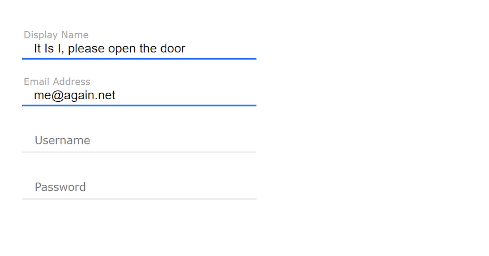
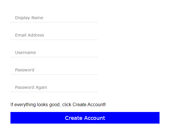
Let's take a look at what we're going to create in this tutorial.
Instead of the traditional placeholder attribute, an extra HTML element was used that will slide up and change font size and color based on whether input container is active or not.
Advantages of Using Vanilla JavaScript and CSS
You could use a UI library with pre-fabricated form elements. But when importing other libraries you will be spending extra time going through documentation, and that doesn't always guarantee your code will work on first try. (Simply because you have to get used to how that library does things.)
On the other hand, if you know your vanilla well, it's really not that difficult to put something together. You'll also avoid running into library's design limitations that can prevent you from getting 100% look you want.
HTML Anatomy of a Custom Input Field
The HTML scaffold for each field:
<div class = "input-container">
  <input type = "text"
      onclick = "this.parentElement.classList.add('active')"
       onblur = "if (this.value.length == 0) this.parentElement.classList.remove('active')"
      onfocus = "this.parentElement.classList.add('active')" />
  <div  class = "split-underline">
    <div></div>
    <div></div>
  </div>
  <div class = "placeholder">Display Name</div>
</div>
There are 3 events attached to the input element:
The onclick event attaches "active" class to the parent container.
The onblur event removes "active" but only if input field's value is empty.
The onfocus event adds "active" class in cases when user navigates to the next or previous input field with Tab or Shift+Tab respectively.
The "active" class activates a CSS transition on a custom underline element (class="split-underline") where the underline consists of 2 separate DIV elements (splitting the underline element into two equal lines 50%) that stretch from middle of the element outward in both directions.
Default Reset For Custom UI
Every time I make a custom UI I tend to reset Chrome's default input field outlines that force ugly black border around focused inputs. I know it's a usability issue but you want to disable it if you're looking to build a 100% custom input UI.
/* This should be browser's default */
* { box-sizing: border-box }

/* Chrome applies blue "usability" background  to autofilled input boxes, but it's a nightmare for custom design */
input:-webkit-autofill, input:-webkit-autofill:hover, input:-webkit-autofill:focus, input:-webkit-autofill:active { -webkit-box-shadow: 0 0 0 30px white inset !important }

/* Remove Chrome outline (same reason as above) */
*:focus { outline: none }
I switched box-sizing to border-box to all elements. This avoids dealing with padding and margin that adds additional space around elements you don't want to get any bigger than the values you set.
The horrendous choices Chrome makes for common UI elements were also overwritten in order to wipe the slate clean and disable those styles.
And finally...the CSS that puts it all together:
.placeholder {
  pointer-events: none;
  position: absolute;
  display: block;
  top: 16px;
  left: 16px;
  font-size: 14px;
  font-family: verdana;
  color: gray;
  transition: 0.2s;
}
This custom placeholder has transition set to 0.2s. I couldn't find a better animation delay for this usecase. It looks fast enough for a click but not too fast so you can actually see the text animate.
The pointer-events: none disables any click events on placeholder element.
This is important because you want your mouse to "click through" to the actual input element. Without this property placeholder would be blocking clicks on input element.
.input-container.active .placeholder {
  top: 2px;
  left: 2px;
  font-size: 12px;
  color: #aaaaaa;
}
This is the same placeholder but in "active" state. The actual "active" class is controlled by the input element's attribute events (onclick, onblur, onfocus). Because the parent element is the same for the input element, placeholder and the underline animation, all we need to do is set "active" to the parent container when input is clicked. This will be done using some JavaScript (as you've already seen in HTML scaffold above.)
.input-container {
  position: relative;
  width: 300px;
  height: 40px;

  display: flex;
  justify-content: center;
  align-items: center;
  flex-direction: column;

  border-radius: 5px;
  padding: 10px;
}
This is the parent input container. It's flex with flex-direction: column which aligns input box and the blue underline vertically.
.input-container input {
   width: 100%;
   font-size: 16px;
   font-family: Arial;
   padding: 0px;
   padding-bottom: 3px;
   padding-top: 20px;
   padding-left: 5px;
   border: 0;
   background: transparent;
}
The actual input element. Nothing special here. Just an element that stretches across entire parent's width.
.split-underline {
   display: flex;
   justify-content: center;
   width: 100%;
   height: 2px;
   background: silver;
}
This is the container for the split underline effect. It will hold two child divs.
 .input-container .split-underline {
   background: #eeeeee;
   width: 300px;
   height: 2px;
   display: flex;
}
The split underline container is a flex.
.input-container.active input {
   background: transparent;
}
This clears the input box background color to transparent.
 .split-underline div {
   transition: 0.2s;
 }
This adds animation delay of 0.2s for transitions. This is what determines the rate at which the blue underline animation plays.
.input-container .split-underline div {
  width: 0px;
  background: #2e71ff;
}
The default color of an active underline. By default (on unfocused inputs) the blue underline is 0px in width.
.input-container.active .split-underline div {
   width: 200px;
   background: #2e71ff;
}
Now that input is clicked, "active" is added to main container and that will animate split underline.
Finally, the submit button:
.submit-button {
  width: auto;
  margin: auto;
  height: 40px;
  background: blue;
  color: white;
  text-align: center;
  line-height: 40px;
  font-size: 18px;
  font-family: verdana;
}
To see it in action here's a jsFiddle: jsfiddle.net/hashnodetutorials/kbrqej5p
I tried doing this in CodePen but it has some odd issue where it triggers an onclick event in input box on page load, even if input box wasn't clicked.
#Octopack is my coding book bundle.
Hey readers! At the end of each tutorial I advertise my coding book bundle. I don't know if it's going to work as I don't really do marketing well. But I decided to follow this protocol just to see what happens.
The pack includes CSS Dictionary, JavaScript Grammar, Python Grammar and few others. Just see if you might need any of the books based on where you are on your coding journey! Most of my books are for beginners-intermediate XP.
I don't know who is reading my tutorials but I put together this coding book bundle that contains some of the best books I've written over the years. Check it out 🙂 I reduced price to some regions like India, Nigeria, Cairo and few others. Prices are just so different here in the U.S. and all over the world.
You can get Octopack by following my My Coding Books link.

